Burberry Logo 2023
LeedoType · 2023
A typographic journal entry examining Burberry's 2023 return to a serif logotype, inspired by the brand's early 20th-century lettering and the organic bowl forms of its original B and R.
About
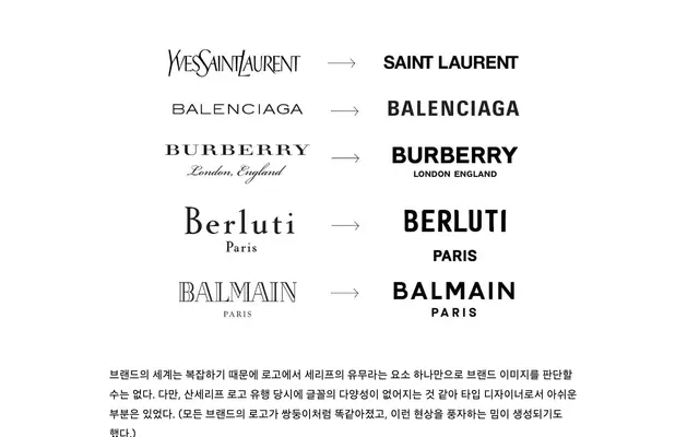
Written from a type designer's perspective, the piece analyses the structural decisions in Burberry's rebrand under Daniel Lee: the reduction of serif size, the straightening of the R's leg, and the tension between the bold curves of the B and R bowls and the more static, rectilinear forms elsewhere. The author welcomes the shift away from the minimalist sans-serif trend that homogenised luxury logos from 2018 onwards, while noting some inconsistencies in stroke weight on letters such as U and E.
Classification
The page discusses Burberry's 2023 logotype, a serif revival drawing from early 20th-century brand lettering. The piece is treated as a typographic analysis entry rather than a retail typeface, but its subject is a custom display serif logotype.