 MegaMegaTypeType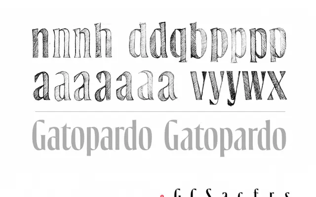
A bespoke display serif created for Revista Gatopardo's twentieth anniversary redesign, with unified uppercase and ascender heights drawn from the magazine's new logo.
About
Commissioned through design firm varela+kimura for Revista Gatopardo's editorial and brand overhaul, the typeface derives its character from the internal counters of the letter O and the distinctive serifs of G and A. Compressed vertical proportions — equalising cap and ascender heights — suit the demands of magazine display setting. The design reinforces a publication identity that balances narrative tradition with contemporary freshness.
Classification
A bespoke display serif designed for a magazine identity, with compressed vertical proportions (uppercase and ascender heights unified) and characteristic details drawn from the internal counters and serif construction of key letters. Its purpose-built display nature places it firmly in the display category.