 MegaMegaTypeType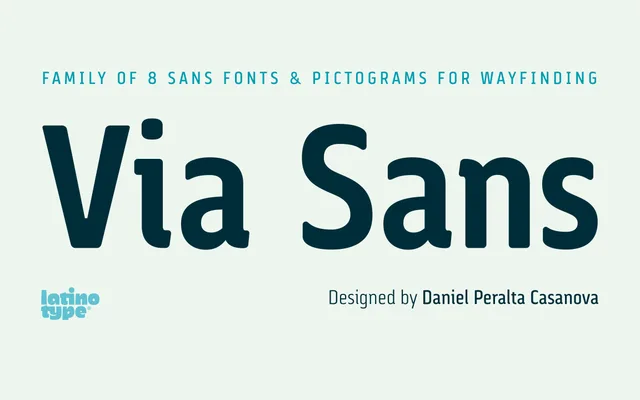
A signage-oriented sans-serif drawing from Steile Futura and DIN 1451, designed to maximise legibility at distance across four weights with a companion pictogram set.
About
Rounded corners reduce the irradiation effect common on reflective signage materials, while ample counters sustain readability across sizes. The family spans four weights with matching italics, covering European accented characters, ligatures, fractions, ordinals and tabular figures. A separate pictogram style rounds out the nine-style family for wayfinding and mapping applications.
Classification
Sits between geometric and humanist sans traditions, explicitly citing Steile Futura and DIN 1451 as references while incorporating neo-humanist characteristics such as ample counters and rounded corners. The wayfinding-oriented design prioritises legibility at distance over strict geometric purity.