 MegaMegaTypeType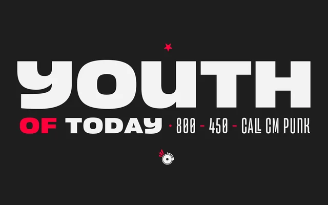
A unicase display sans-serif by Marcelo Moya, inspired by Latin American wrestling and boxing poster typography, spanning nine weights from condensed ExtraLight to expanded Ultra.
About
Versus draws its character from the vernacular lettering of Latin American boxing and wrestling posters, combining shifting width proportions across its weight range with orthogonal terminals and short ascenders and descenders. The unicase construction and condensed-to-expanded spread give the family a distinctive visual rhythm suited to logos, titles, posters and branding. Stylistic alternates and a full ligature set extend the expressive range further, with support for over 200 languages.
Classification
A unicase sans-serif with orthogonal terminals and variable proportions across weights, designed explicitly for display use in branding, posters and titling. Its shifting widths and condensed-to-expanded range place it firmly in the display category rather than conventional sans-serif.