 MegaMegaTypeType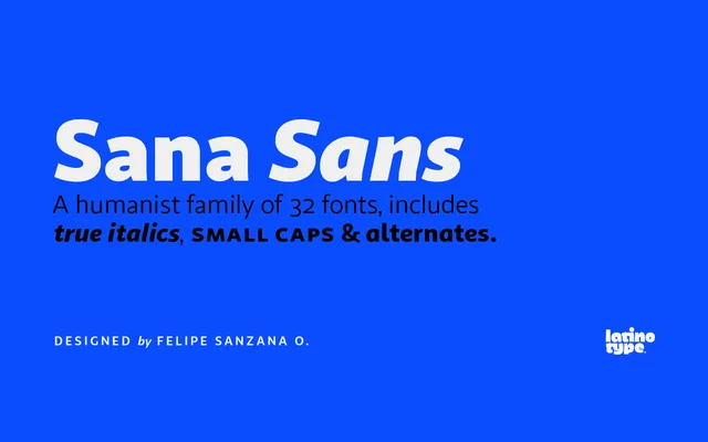
A humanist sans-serif in eight weights with italics and an alternate glyph family, designed primarily for publishing and extended text use.
About
Sana Sans covers 32 styles across eight weights from Thin to Heavy, each with matching italics. The Alt subfamily provides variant forms for characters including the lowercase a, e, l, q and y, as well as uppercase G, L and Q, giving designers flexibility in setting. Its open, clean construction is intended to hold up in both long-form print and screen contexts.
Classification
Described explicitly as a humanist functional sans-serif, with open, legible letterforms suited to extended text setting. The alternate family offering single-storey 'a' and variant 'g' forms reinforces the humanist character.
Weights
ThinLightBookRegularMediumBoldBlackHeavy
Family
Sana Sans BasicSana Sans Alt
Languages
Latin
Tags
humanistsans-serifpublishingtextversatilemultipurposelegibleclean