 MegaMegaTypeType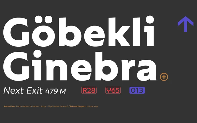
A geometric sans in two optical cuts — Text and Display — designed for branding work, softening strict geometry with a warmer, more approachable personality.
About
Rebrand splits its 33 styles across a seven-weight Text cut and a nine-weight Display cut, the latter adding alternate characters and swashes for greater expressive range. Both subfamilies include small caps and cover basic Cyrillic. A companion Dingbats set rounds out the family for brand-system use.
Classification
Explicitly described as a Geometric Sans Serif, built around circular geometry with a warmer, more approachable character than cold mathematical purity. Two optical sub-families — Text and Display — share the same geometric foundation.
Weights
ThinExLightLightRegularMediumSemiBoldBoldExBoldHeavyBlack
Optical sizes and widths
TextDisplay
Family
Rebrand TextRebrand DisplayRebrand Dingbats
Languages
LatinCyrillic
Tags
geometricsans-serifbrandingdisplaytextdingbatssmall-capsfriendly