 MegaMegaTypeType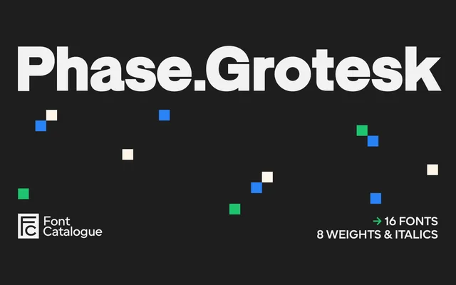
A low-contrast grotesque with closed apertures and compressed curves, drawing on early signage and catalogue typefaces across eight weights with matching italics.
About
Built on uniform stroke widths and slightly compressed, tensioned curves, Phase Grotesk deliberately avoids geometric regularity in favour of a technical, restrained character. Closed apertures on the e, c and a reference early sans serifs from signage and forgotten foundries, preserving the weight irregularities and optical quirks that gave those sources their candid quality. The 16-style family scales from high-impact display use to interface and editorial settings without losing legibility.
Classification
A low-contrast, closed-aperture grotesque with uniform stroke widths and slightly compressed curves, drawing on early sans serif signage and catalogue typefaces rather than the geometric or humanist traditions.