 MegaMegaTypeType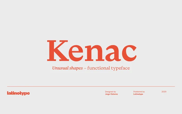
A high-contrast display serif by Jorge Cisterna that blends Roman structure with calligraphic modulation and Victorian detailing across five weights with matching italics.
About
Kenac pairs the structural logic of Roman type with the thick-thin modulation of calligraphy, giving it an unusual but legible character that works well at headline sizes. Five weights run from Regular to Black, each accompanied by a matching italic. The family is pitched at editorial contexts such as book covers, magazine headers and brand identity work.
Classification
A high-contrast serif with calligraphic modulation and Victorian influences, combining thick-thin stroke contrast with Roman structure. The pronounced contrast and distinctive letterforms make it primarily suited for display and editorial use rather than body text.