 MegaMegaTypeType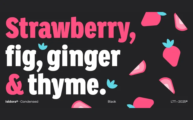
A geometric sans-serif in 42 styles across two subfamilies – a classic cut and a display-oriented alternate – each spanning seven weights with italics and condensed variants.
About
Designed by Enrique Hernández V. and released in 2016, Isidora draws from early 20th-century geometric typefaces while softening its rational structure with rounded terminals and diagonal cuts. The family splits into two subfamilies: the more classical Regular and the display-oriented Alt, both covering seven weights with matching italics. The Condensed extension adds further versatility for headlines, branding and editorial work where space economy matters.
Classification
A geometric sans-serif with rounded terminals and softened diagonal cuts, drawing from early 20th-century geometric typeface conventions while maintaining a contemporary, friendly character.