 MegaMegaTypeType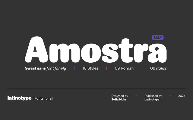
A rounded, high-contrast sans-serif from Sofia Mohr with droplet terminals and nine weights, each paired with an italic, suited to projects requiring strong typographic hierarchy.
About
Amostra's defining characteristic is how its stroke contrast increases with weight, giving heavier styles a markedly different feel from the lighter cuts. Droplet-shaped endings replace conventional terminals, lending the family a distinctive organic quality across all 18 styles. Stylistic alternates and ligatures extend its range for branding, packaging and editorial applications.
Classification
A rounded, high-contrast sans-serif with organic qualities. The droplet-shaped terminals and variable stroke contrast across weights distinguish it from geometric or grotesque models, placing it closer to humanist sans traditions with a contemporary expressive bent.