 MegaMegaTypeType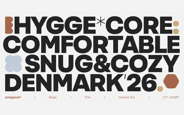
A geometric sans from Sofia Mohr and the Latinotype Team that balances structured forms with softened curves across seven weights, matching italics and a variable font.
About
Amigável is built on a geometric framework tempered by generous proportions and subtle optical corrections that prevent the coldness common to strict geometric designs. Stylistic alternates offer both single-storey and double-storey forms of 'a' and 'g', letting designers dial between expressive and conventional registers. A high x-height and open counters support legibility at small sizes across interface, editorial and branding contexts.
Classification
Built on a precise geometric foundation with softened details and open counters, placing it firmly in the geometric sans tradition. The family prioritises optical refinement and warmth over strict geometry, distinguishing it from more austere geometric designs.