 MegaMegaTypeType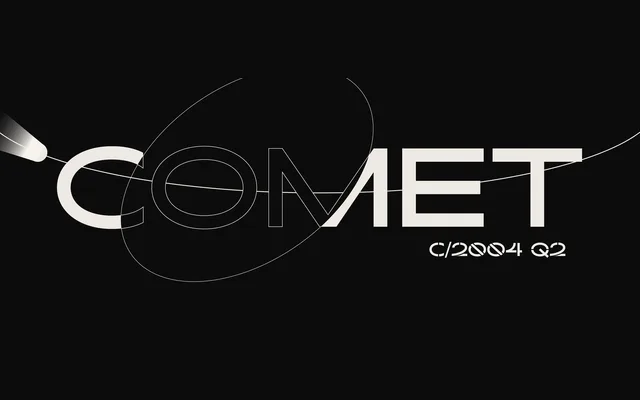
A single-weight display family in three stylistic cuts — Normal, Stencil and Stencil+Texture — rooted in early grotesque forms and inspired by the elliptical motion of comets.
About
Designed by Brígida Guerreiro in 2019, Kaito Sans draws on early 20th-century grotesque conventions while introducing an elliptical quality meant to evoke comet movement. The three styles allow the family to shift registers: the Normal cut suits editorial titles and book covers, the Stencil lends itself to poster work, and the Stencil+Texture variant carries a rougher, streetwear-oriented tone. Latin-script coverage extends to over 80 languages including Western and Central European, South-Eastern European, Vietnamese and Pinyin.
Classification
A display typeface drawing on early 20th-century grotesque letterforms with an elliptical, comet-inspired character. The three-style family includes a standard cut plus stencil and textured stencil variants, positioning it firmly in the display category.