 MegaMegaTypeType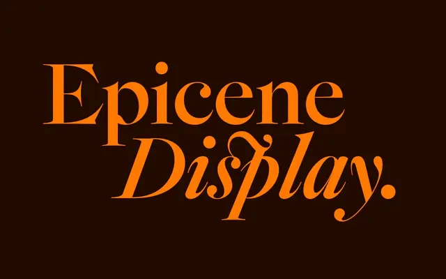
A Baroque Old-Style serif in two optical cuts, synthesising the work of 18th-century Dutch masters Rosart and Fleischmann, with the cultural argument baked into its name: typefaces carry no gender.
About
Released in September 2021, Epicene exists as Display and Text cuts, each offering five weights with matching italics. Kris Sowersby drew from Rosart's exaggerated geometric capitals and Fleischmann's ink-dense, small-text italics, arriving at a distinctive scalloped serif that sits at the crossing of both designers' sensibilities and reads with equal conviction at headline and body sizes. The name comes from Susan Sontag's "Notes on Camp" – epicene meaning lacking gender distinction – a deliberate pushback against the long-held coding of ornamental type as feminine and functional forms as masculine.
Classification
Baroque Old-Style drawing from 18th-century Dutch masters Jacques-François Rosart (1714–1777) and Johann Michael Fleischmann (1707–1768); not a revival but a modernisation, synthesising Rosart's exaggerated geometric capitals with Fleischmann's ink-pooled, small-text sensibility; signature scalloped serifs combine the smooth inner curve from Rosart with the sharp outer scallop from Fleischmann, adapted to function across the full character set at both body and display sizes; available as two optical cuts – Display and Text – each with five weights and matching italics.