 MegaMegaTypeType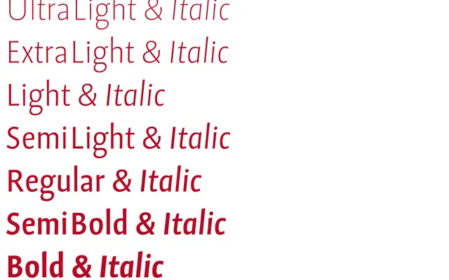
A text face that trades a neutral grotesque skeleton for wide classical capitals and a narrow, blackletter-inflected lowercase.
About
Grotext looks like a sanserif at a glance but behaves like a historical text face: generous uppercase paired with a condensed, uncial-flavoured lowercase that saves space without losing warmth. Long ascenders and descenders and a compact Grotext No2 cut give it range across editorial and identity work. A DIN 91379-compliant version extends its diacritic support for official German-language use.
Classification
Grotext pairs wide classical capitals with a narrow lowercase built from blackletter and uncial forms, giving it a historical serif character rather than a neutral grotesque despite the name.
Weights
UltralightExtralightLightSemilightRegularSemiboldBold
Family
Grotext No2
Languages
Latin
Tags
text serifhistoricaleditorialfine typographydiacritics