Mundo Grafico
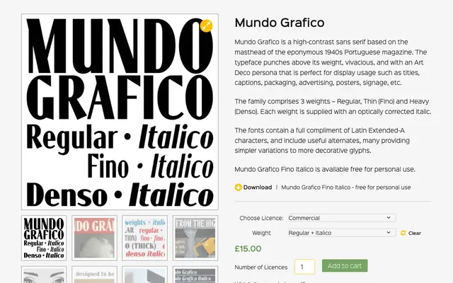
A high-contrast display sans-serif revived from the masthead of a 1940s Portuguese magazine, available in three weights each with a matching italic.
About
Based on the lettering of the eponymous Portuguese magazine from the 1940s, Mundo Grafico carries a vivacious Art Deco personality suited to titles, packaging, advertising and signage. The family offers three weights – Fino (Thin), Regular and Denso (Heavy) – each paired with an optically corrected italic. Latin Extended-A character support is included alongside alternates that offer simpler variations of the more decorative glyphs.
Classification
A high-contrast sans-serif with Art Deco characteristics derived from a 1940s Portuguese magazine masthead, intended primarily for display use. Its dramatic stroke contrast and decorative alternates place it firmly in the display category rather than a functional sans-serif.