Curwen Sans
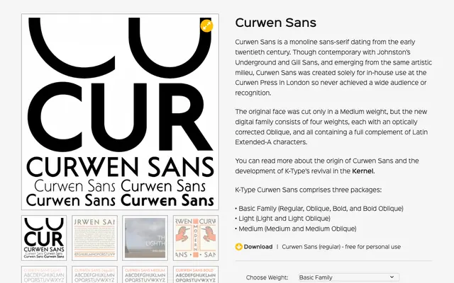
A digital revival of the early twentieth-century monoline sans-serif created exclusively for in-house use at the Curwen Press in London, expanded from the original single Medium weight into a four-weight family with obliques.
About
Contemporary with Johnston Underground and Gill Sans, Curwen Sans emerged from the same British artistic milieu but remained obscure, having been cut solely for the Curwen Press and never commercially released. K-Type's revival extends the original single weight into Light, Regular, Medium and Bold, each accompanied by an optically corrected Oblique. All styles include a full Latin Extended-A character set.
Classification
Monoline sans-serif revival from the early twentieth century, sharing characteristics with Johnston Underground and Gill Sans. Its even stroke weight and geometric sensibility place it firmly in the geometric sans tradition.