Banks & Miles
K-Type · John Miles (original); K-Type (revival) · 2024
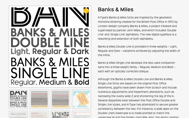
A digital revival of the geometric monoline lettering designed for the British Post Office in 1970 by London studio Banks & Miles, expanded into two families covering double-line and single-line alphabets.
About
The Double Line family offers three weights achieved by varying the width of the internal inline, while the Single Line family provides Regular, Medium and Bold with optically corrected obliques. K-Type has redrawn all glyphs from scratch, reconciling inconsistencies between the original alphabets and extending coverage to Latin Extended-A. Distinctive details such as the teardrop-shaped bowls of a, b, d, g, p and q are faithfully preserved and celebrated.
Classification
A geometric monoline sans with inline detailing, derived from bespoke Post Office lettering from 1970. The double-line inline construction and circular rounded forms place it firmly in the display category rather than a conventional grotesque or geometric sans.