 MegaMegaTypeType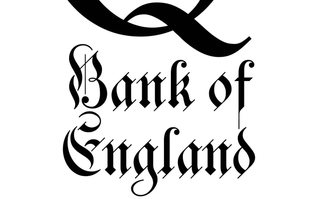
A blackletter face inspired by the lettering on the 2007 Series F British twenty pound note, drawing on German Kanzlei tradition and the work of English calligraphers John Ayres and George Bickham.
About
The design includes OpenType swash variants for all uppercase letters and the ampersand, nine lowercase alternates, and sixteen ornamental flourishes, giving designers considerable expressive range. Its reference points span formal banknote lettering and historical English penmanship, resulting in a face that sits between institutional gravitas and decorative script. Coverage is limited to a single weight with no italic or condensed cuts.
Classification
A blackletter design rooted in German Kanzlei (Chancery) tradition and English calligraphic sources, drawing directly from the lettering on Series F twenty pound banknotes. The style blends formal blackletter structure with calligraphic influences from John Ayres and George Bickham.