Armoire
Justin Penner · Justin Penner · 2021
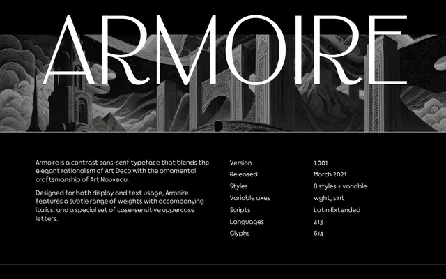
A high-contrast variable sans-serif drawing on Art Deco geometry and Art Nouveau ornament, available in four weights with matching italics and case-sensitive uppercase forms.
About
Released in 2021, Armoire combines the rational structure of Art Deco lettering with the decorative sensibility of Art Nouveau, resulting in a typeface with visible stroke contrast and considered detailing. Four weights span Regular to Bold, each with an italic, and the variable font exposes both weight and slant axes. A dedicated set of case-sensitive uppercase letters extends its usefulness for titling and display settings.
Classification
A high-contrast sans-serif with visible stroke modulation, blending Art Deco geometric rationalism with Art Nouveau ornamental tendencies. The contrast and letterform refinement place it closer to a display sans than a neutral grotesque.