JT Barnez
sans-serifgeometric sans
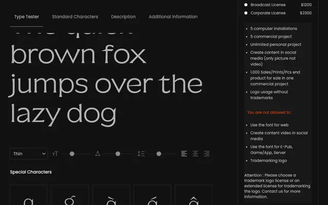
A seven-weight geometric sans-serif from Joliciatype, ranging from Thin to Bold with no italic complement.
About
JT Barnez spans seven weights from Thin to Bold, offering a usable range for both display and text settings. The family lacks italic or condensed variants, limiting its versatility. It follows the conventions of contemporary independent foundry releases without a strongly differentiated voice.
Classification
The clean, structured appearance and weight range suggest a geometric or neo-grotesque sans-serif, typical of contemporary display and text typefaces from independent foundries.
Weights
ThinExtra LightLightRegularMediumSemi BoldBold
Languages
Latin
Tags
geometricsans-serifdisplaycontemporaryindependentcleanneutral