Rig Sans
Jamie Clark Type · Jamie Clark · 2021
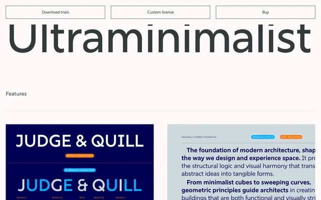
A geometric sans-serif in 16 styles, originally developed to survive 3D distortions, with wide apertures and clipped terminals that keep it legible across print and screen.
About
Rig Sans was built with simplicity as a structural constraint rather than an aesthetic choice, its letterforms engineered to remain readable under 3D distortion. Wide apertures and a generous x-height give it strong legibility at small sizes, while the clipped terminals lend a quiet confidence without decoration. The family covers over 250 languages and ships with a thorough suite of OpenType features including oldstyle figures, fractions, case-sensitive forms and a range of alternate characters.
Classification
A geometric sans-serif with wide apertures, clipped terminals and a generous x-height. The even stroke weight and simplified letterforms place it firmly in the geometric tradition, though open counters give it a humanist approachability.