 MegaMegaTypeType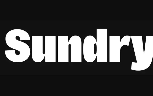
A warm early 20th-century grotesque revival across three widths and seven weights, its hand-drawn origins kept just legible enough to feel human rather than mechanical.
About
Sundry is J Foundry's interpretation of the early 20th-century grotesque tradition, drawn and cut by hand to preserve the idiosyncrasies and warmth of the originals without sacrificing consistency. The family runs three widths – Standard, Narrow and Condensed – each with seven weights from Thin to Super Black and matching italics, totalling 42 styles plus variable font editions. Large x-height, closed apertures and alternate glyphs (including alternate a and g) make it well-suited to editorial, newspaper and text work where personality is an asset.
Classification
Early 20th-century grotesque revival with humanist warmth. Hand-drawn and hand-cut origins give the design its idiosyncratic character — closed apertures, large x-height, consistently rounded forms — while remaining readable and structurally consistent across three widths.