 MegaMegaTypeType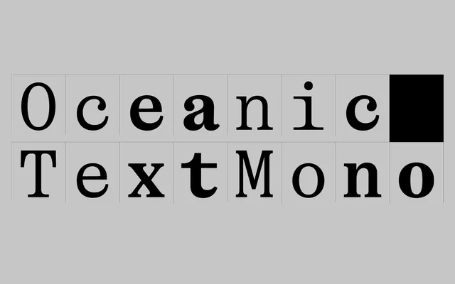
A monospaced serif rooted in fat-face tradition, with letterforms strange enough to stop the eye yet disciplined enough to hold up in code and technical documents.
About
Oceanic Text Mono is the fixed-width member of the Oceanic family, adapting the display variant's eccentric details for coding, tabular data and continuous text. Contrast is dialled down and proportions sit slightly narrower than the display cut, pulling the idiosyncrasy into a readable range across four weights. The lowercase c and e recall prehistoric sea creatures, R and K sit in deliberate tension with the rest of the alphabet, and it still functions.
Classification
Monospaced serif drawing from 18th and 19th-century fat-face traditions – Bodoni, Canon and Scotch Romans. Contrast is reduced and proportions are slightly condensed versus the display cut to suit continuous reading and code. Letterforms carry deliberate strangeness: c and e evoke prehistoric oceanic creatures; R and K are intentionally dissonant with the rest of the alphabet. Fixed-width structure throughout. Part of the broader Oceanic family alongside Display and Text cuts.