Argus
Interrobang Type · 2019
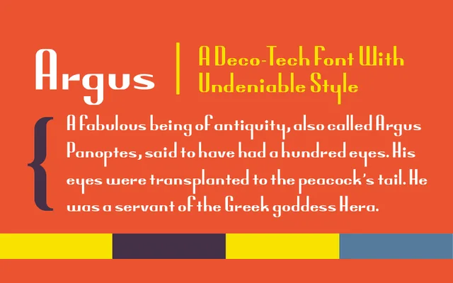
A single-weight display face that fuses Art Deco forms with a futuristic character, primarily aimed at logotype work but serviceable in copy with careful leading.
About
Argus originated from a study of a corporate logotype and evolved into something broader, landing at an unusual intersection of Art Deco geometry and forward-looking letterforms. It includes contextual alternates, discretionary ligatures, small caps and old-style figures, giving it more typographic depth than a typical logo font. The designer has noted forthcoming alternates with varying descender depths, suggesting the family is still expanding.
Classification
A display face blending Art Deco styling with a futuristic aesthetic, explicitly designed for logos and headlines rather than extended text use.