Yorkten
Insignedesign · Jeremy Dooley
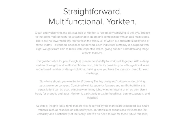
A 54-style geometric sans from Jeremy Dooley, spanning three widths and eight weights with italics, built for print and screen use from headlines to app interfaces.
About
Yorkten's angled main stems and geometric structure give it a distinctive character across its Extended, Normal and Condensed subfamilies. With eight weights per width and matching italics, the family offers considerable range for editorial, branding and digital work. The designer's intention was a compact, legible structure suited equally to large display headlines and smaller screen-based contexts.
Classification
Geometric sans-serif with angled main stems and a fashionable, structured composition. Three widths (Extended, Normal, Condensed) across eight weights each signal a systematic geometric grotesque approach.