displayExpanded display
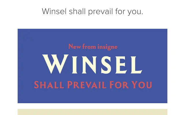
A nine-weight expanded display face drawn from British vernacular poster lettering of the 1920s to 1950s, built on sharp, angular brush strokes suited to heavy titling work.
About
Winsel's expanded proportions and pointed construction reference the bold poster letterforms that characterised British commercial printing across the mid-twentieth century. Nine weights run from fine to compact and muscular, each carrying OpenType features including Small Caps and Titling Caps. European Latin language support is included across the full weight range.
Classification
An expanded, angular display typeface rooted in British vernacular poster lettering of the 1920s–1950s, with pointed brush-stroke construction and a thick, sturdy appearance suited to titling use.
Weights
ThinExtraLightLightRegularMediumSemiBoldBoldExtraBoldBlack
Languages
Latin
Tags
displayposterexpandedangularvintagebritishtitlingbold