Terfens Contrast
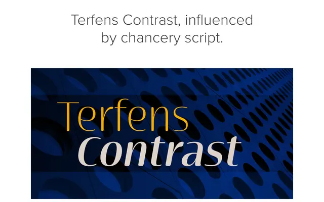
A high-contrast humanist serif derived from the chancery-script-influenced Terfens family, combining calligraphic energy with a tall x-height and refined stroke tension.
About
Terfens Contrast takes the humanist DNA of Terfens and reinterprets it through a high-contrast nib, producing letterforms that feel simultaneously vigorous and delicate. The tall x-height keeps the type approachable without sliding into informality. With over 500 glyphs per weight and a broad set of OpenType features including swashes, ligatures and oldstyle figures, it is positioned as a branding and editorial workhorse.
Classification
Derived from Terfens, a chancery-script-influenced humanist typeface, Terfens Contrast introduces high stroke contrast rendered as if with a narrow nib, placing it in the high-contrast humanist serif tradition with calligraphic roots.