Steagal
Insignedesign · Robbie de Villiers
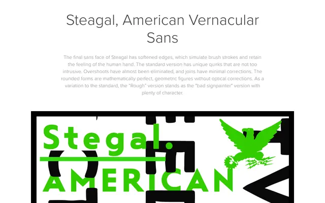
A geometric sans rooted in American sign-painting traditions of the 1930s–50s, with softened edges and minimal optical corrections that preserve the feel of the human hand.
About
Steagal draws on TVA-era American vernacular lettering and the work of Morris Fuller Benton to define a typeface that sits between crisp geometry and naive hand-brushed warmth. Five weights come packed with OpenType features including three Art Deco alternate sets and over 200 alternate characters, plus a monospaced variant. A companion 'Rough' subfamily amplifies the imperfect sign-painter character for applications requiring more expressive texture.
Classification
A geometric sans with deliberate hand-lettered warmth, drawing from American sign painting traditions of the 1930s–50s and the work of Morris Fuller Benton. Softened edges and minimal optical corrections give it a vernacular, brush-influenced character distinct from purely rational geometric designs.