sans-serifgeometric sansitalic
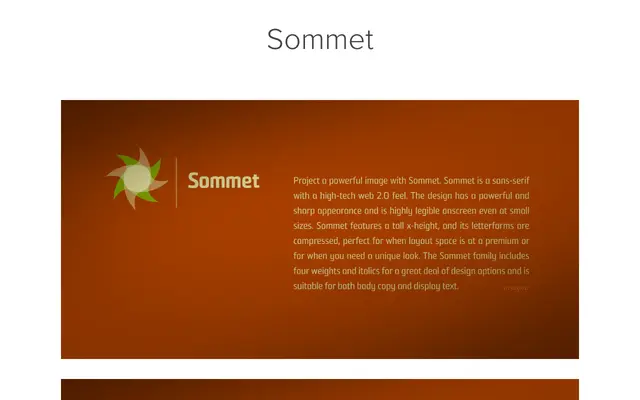
A compressed geometric sans-serif designed for screen legibility, with a tall x-height, six weights and matching italics updated in 2010.
About
Sommet's compressed letterforms and tall x-height make it well-suited to space-constrained layouts, both for body copy and display use. The design carries a sharp, high-tech character consistent with the web 2.0 aesthetic of its era. Six weights with italics give it sufficient range for varied typographic applications.
Classification
A compressed geometric sans-serif with a tall x-height and sharp letterforms, positioned as a screen-optimised typeface with a web 2.0 character. Its compressed proportions and high legibility at small sizes place it firmly in the geometric sans-serif tradition.
Weights
ThinLightRegularMediumBoldBlack
Languages
Latin
Tags
compressedgeometricscreenwebsharplegiblehigh-techdisplay