Solitas Contrast
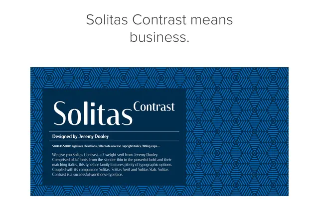
A high-contrast sans-serif developed as part of the Solitas type system, aiming for a crisper, more modern alternative to existing options in the genre.
About
Solitas Contrast sits within a broader family that includes the low-contrast Solitas and serifed companions, each designed to share an organic, free-flowing character. The high contrast between thick and thin strokes gives it a strong visual presence suitable for display use, while the clean, modern construction keeps it versatile. The design takes cues from Dutch and broader European type traditions.
Classification
A high-contrast sans-serif with strong thick-thin stroke variation, placing it in the high-contrast or didone-influenced sans category. The design draws on a European, Dutch-inflected aesthetic rather than the neutral grotesque tradition.