Senlot Sans
sans-serifhumanist sans
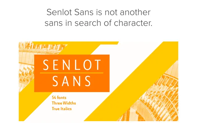
A high-contrast sans serif companion to the Senlot family, incorporating calligraphic details and small capitals across nine weights.
About
Drawing on the calligraphic character of its serif predecessor, Senlot Sans carries more stroke contrast than most sans serifs, giving it a refined, slightly formal presence. Nine weights from thin to bold are supported by titling capitals, small capitals, superscripts, subscripts and open-style figures. Coverage extends to over 72 Latin-based languages.
Classification
A sans serif with notable stroke contrast and calligraphic influences drawn from its serif companion Senlot, placing it closer to humanist sans territory than geometric or grotesque traditions.
Weights
ThinLightRegularMediumSemiBoldBoldExtraBoldBlackHeavy
Languages
Latin
Tags
humanistcalligraphiccontrastelegantlatinsmall-capsversatileserif-companion