Senlot Didone
Insignedesign · 2019
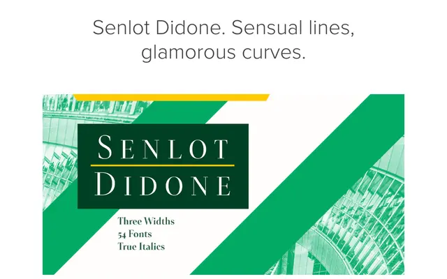
A high-contrast Didone serif spanning three widths and nine weights, designed as a serifed companion to the Senlot family for display and branding work.
About
Senlot Didone extends the Senlot family with extreme stroke contrast and the characteristic vertical stress of the Didone genre, offered in Condensed, Normal and Extended widths across nine weights with matching italics – 54 fonts in total. OpenType features include titling capitals, superscripts, subscripts and oldstyle figures, with coverage across more than 72 Latin-based languages. It is positioned primarily for logos, packaging, advertising and editorial display use.
Classification
A high-contrast serif in the Didone tradition, with the extreme thick-to-thin stroke contrast and vertical stress characteristic of the genre. Available in three widths and nine weights, with italics throughout.