Sabler Titling
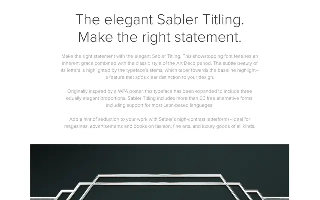
An Art Deco titling face with high-contrast letterforms and stems that taper towards the baseline, available in three proportions with over 60 alternate glyphs.
About
Inspired by a WPA poster, Sabler Titling distils the decorative vocabulary of the Art Deco period into a typeface suited to fashion, luxury and editorial contexts. Its defining feature is stems that taper towards the baseline, lending each letter a poised, almost calligraphic quality. The family spans three proportions and includes broad Latin-language support alongside more than 60 free alternate forms.
Classification
High-contrast display typeface with tapering stems and strong decorative character rooted in the Art Deco aesthetic, clearly intended for large-scale titling use rather than continuous text.