Pauline Didone
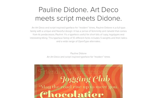
A high-contrast Didone family of 10 styles across five weights with italics, blending Art Deco geometry with script-derived brush strokes and over 150 OpenType alternates.
About
Pauline Didone draws from its predecessor Pauline, a geometric sans with retro script influences, reinterpreting those qualities through extreme stroke contrast in the Didone tradition. The result is a display family suited to logotypes, short copy and titling work where decorative character is required. Over 150 alternate glyphs, including ball terminal swash variants, are accessible via OpenType style sets in Adobe Suite and Quark.
Classification
High-contrast Didone with Art Deco and script influences, characterised by deliberate contrasting brush strokes and geometric construction inherited from its predecessor Pauline. The extreme stroke contrast places it firmly in the Didone category despite its decorative and script-derived qualities.