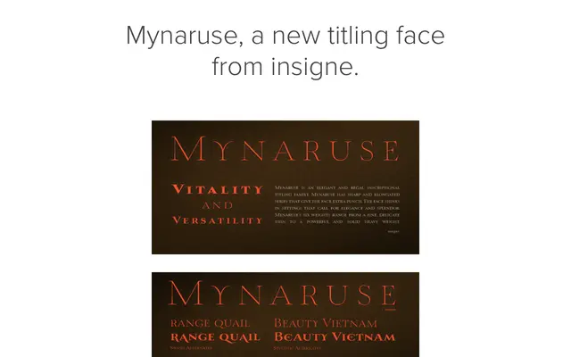
A six-weight roman inscriptional titling family with sharp, elongated serifs and OpenType features including swash alternates and ligatures.
About
Mynaruse draws from the Roman lapidary tradition, offering sharp and elongated serifs that give the design a formal, commanding presence suited to high-register display settings. Six weights run from a fine thin to a solid heavy, allowing flexibility across decorative and editorial applications. OpenType features include swash alternates, titling forms, ligatures and miscellaneous alternates accessible through Adobe applications and QuarkXPress.
Classification
A roman inscriptional titling face with sharp, elongated serifs characteristic of classical lapidary letterforms. The upright, formal structure and range of weights align it with display serif traditions derived from Roman monumental inscriptions.