Le Havre Titling
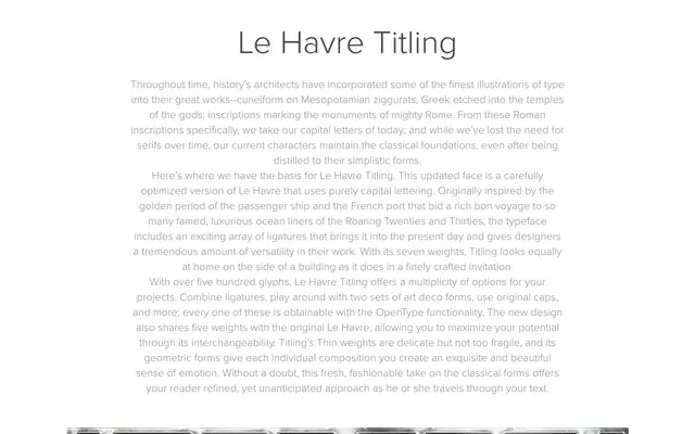
An all-capitals Art Deco display face in seven weights, derived from Le Havre and inspired by the golden age of French ocean liner typography of the 1920s and 1930s.
About
Le Havre Titling strips the original Le Havre down to purely capital letterforms, offering over 500 glyphs including ligatures, two sets of Art Deco alternates and original caps, all accessible via OpenType features. Five of its seven weights align directly with those of the parent family, allowing the two to be used interchangeably across a project. The geometric forms and delicate Thin weights make it suited to large-scale signage and fine print applications alike.
Classification
All-capitals display face with geometric Art Deco forms, ligatures and two sets of decorative cap variants. Derived from Le Havre, a typeface inspired by 1920s–30s ocean liner typography.