Haboro Squared
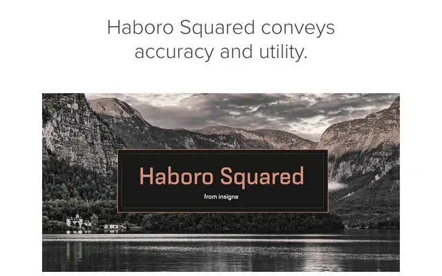
A squared geometric sans in eight weights with italics, drawing on mid-century American optimism through softened angles and playful alternate glyphs.
About
Haboro Squared takes its cues from the post-war American design mood of the 1950s and 1960s, combining angular, consistent strokes with gently rounded letterforms and quirky alternate terminals. Eight weights from Thin to Black, each paired with an italic, make it suitable for both display headings and short body copy. It sits within the broader Haboro Hyperfamily alongside Haboro Sans, Serif and Didone.
Classification
A geometric sans with gently rounded, squared letterforms evoking mid-century American design. The angular yet softened strokes and playful alternates place it firmly in the geometric sans tradition with display-friendly characteristics.