Haboro Gothic
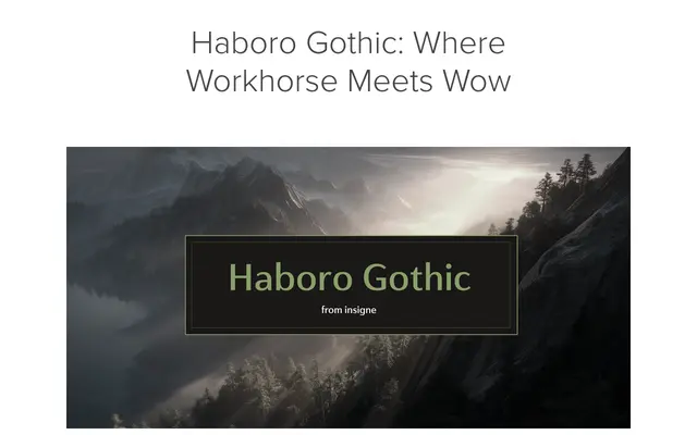
A geometric sans with medium stroke contrast, designed to bring quiet personality to branding, editorial and UI work across a full weight range with matching italics.
About
Haboro Gothic sits between the rigidity of monolinear geometrics and the warmth of humanist sans serifs, using moderate contrast to add rhythm without sacrificing legibility. It ships with a full weight range from thin to bold, matching italics, and OpenType features including stylistic alternates and ligatures. Spacing has been tuned for both high-resolution print and responsive web use.
Classification
Geometric construction with medium stroke contrast, positioned as a refined alternative to sterile geometric sans serifs. The medium contrast distinguishes it from purely monolinear geometrics while retaining clean, structured letterforms.