Haboro Contrast
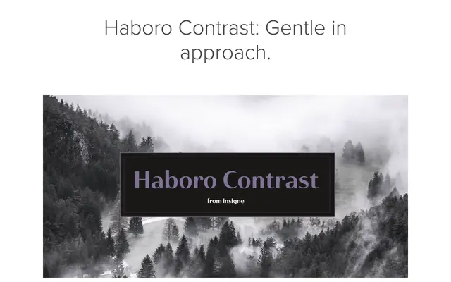
A high-contrast geometric sans designed for display use, sharing the skeletal forms of Haboro Sans but rebalanced for elegant, refined performance across print and digital publishing.
About
Built from the same geometric foundations as Haboro Sans, Haboro Contrast redistributes stroke weight to achieve a sharper, more refined character suited to magazine layouts and editorial brochures. Each weight has been individually adjusted to maximise visual impact rather than simply scaling contrast uniformly. OpenType features including ligatures, stylistic sets, small caps and old-style figures extend its typographic range.
Classification
A geometric sans-serif with high stroke contrast, distinguishing it from its sibling Haboro Sans. The elevated contrast between thick and thin strokes gives it a display-oriented character more associated with didone sensibilities applied to a sans skeleton.