Cavole Slab
Insignedesign · 2011
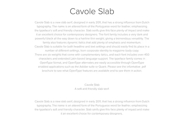
A six-weight slab serif with Dutch typographic influences, spanning hairline to black, each weight accompanied by a complementary italic.
About
Designed in early 2011, Cavole Slab takes its name from an altered form of the Portuguese word for feather, reflecting a softer, friendlier character than many slab serifs. Six weights with matching italics cover a broad tonal range, from a powerful black down to a hairline, and each font includes over 450 characters with extended Latin language support. The family suits both headline and text settings, from magazine body copy to corporate identity work.
Classification
A slab serif with soft, rounded characteristics influenced by Dutch typography. The friendly proportions and dynamic italics place it closer to the humanist slab tradition than geometric or Egyptian styles.