Cabrito Didone
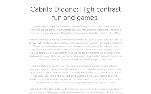
A high-contrast Didone serif with calligraphic warmth, featuring ink-pooled serifs and obliques across 46 fonts supporting 72 languages.
About
Cabrito Didone belongs to the Cabrito family, originally designed for children's literacy and rooted in clear letterform recognition. It brings Didone contrast ratios to a more approachable register, with serifs that evoke ink pooling at sharp-nib points and a calligraphic flow that softens the style's usual formality. The family includes upright obliques, alternates, ligatures, old-fashioned figures and compact caps via OpenType, with over 600 glyphs per font.
Classification
High-contrast serif with Didone structure, distinguished by calligraphic influences such as ink-pooled serifs drawn with a sharp nib, blending formal contrast ratios with handwritten warmth.