Belda Didone
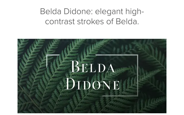
A high-contrast didone offshoot of the Belda family, offering multiple weights and widths with OpenType alternates including small capitals and titling figures.
About
Belda Didone draws from its parent typeface, Belda, amplifying the stroke contrast and sharpening the serifs in line with the classical didone tradition. The family is positioned for luxury applications: book jackets, advertising and packaging, where high contrast and sharp modulation attract attention. OpenType features including small capitals and titling alternates extend its usefulness across both text and display settings.
Classification
High-contrast didone with sharp serifs, delicate curves and strong stroke contrast referencing the classical Didot/Bodoni tradition. The family includes multiple weights and widths alongside OpenType alternates such as small capitals and titling cuts.