Ashemore Contrast
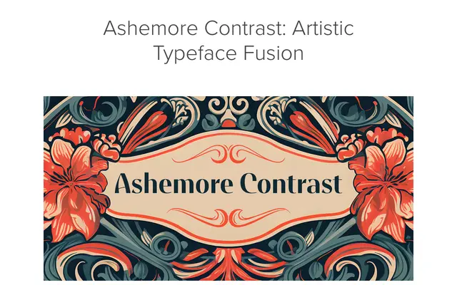
A high-contrast display face drawing on Art Nouveau and Arts and Crafts traditions, part of the wider 54-style Ashemore family with condensed and extended widths.
About
Ashemore Contrast sits within the larger Ashemore family, spanning thin to black across condensed, regular and extended widths. Distinctive terminators on C, G and S reference Art Nouveau letterform conventions, while small caps, automatic ligatures and OpenType alternates add typographic depth. Extended Latin coverage supports over 40 languages, making it suited to packaging and multilingual editorial work.
Classification
High-contrast display typeface fusing Art Nouveau ornamental sensibility with Arts and Crafts craft tradition and geometric sans-serif structure, distinguished by decorative terminators on C, G and S.