 MegaMegaTypeType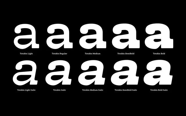
A moderately reverse-contrast slab serif with soft curves and a sturdy structure that still reads well at small sizes.
About
Totokin flips the usual stroke logic, giving horizontal strokes more weight than verticals, then rounds off the effect with gentle, welcoming curves suited to branding, editorial, packaging and signage work.
Classification
A moderately reverse-contrast slab serif, with horizontal strokes thicker than verticals, softened by curved, gentle letterforms.
Weights
LightRegularMediumSemiBoldBold
Languages
Latin
Tags
slab serifreverse contrasteditorialpackagingsignage