Wendelin Pro
IngoFonts · 1997
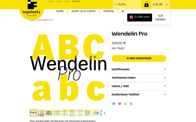
A grotesque text face rooted in 19th-century German grotesk tradition, distinguished by flared stroke endings, angled terminals and genuine cursive italics rather than sloped romans.
About
Originally designed in 1997 for the magazine 'motion' with Franklin Gothic as a reference, Wendelin Pro has since been expanded into a full family spanning Thin to ExtraBold with matching italics. The design departs from its historical sources through details such as a diagonal M, slightly flared upright strokes that approach serifs, and rounded interior forms on h, n and m. The italic cuts are drawn as true cursives, with distinctive forms for f, e, k and r, rather than mechanically slanted versions of the uprights. The Pro version adds Unicode support covering European languages, Greek, Cyrillic and Vietnamese, alongside OpenType features for ligatures, oldstyle figures, tabular figures and a long s with accompanying ligatures.
Classification
A 19th-century grotesque revival with idiosyncratic details: angled stroke terminals, slightly flared upright strokes on lowercase letters and rounded interior forms. Originally inspired by Franklin Gothic, it sits firmly in the grotesk tradition while departing from strict historical models.