Maier's Neue Nr. 8
IngoFonts · Karl O. Maier · 2014
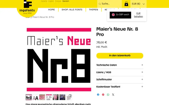
A digitised and extended revival of a strictly geometric Art Nouveau lettering alphabet from a pre-WWI German technical draughtsman's manual, cleaned to precise contours and expanded to four weights with left-leaning obliques.
About
The original source is a narrow galvano-printed specimen from the Otto Maier Verlag in Ravensburg, published shortly before 1914 as a model for technical professionals who still lettered their drawings by hand. IngoFonts scanned and enlarged the original, then produced two versions: the 'Alte' retains rough, hand-made edges, while this 'Neue' edition presents clean, exact contours. The family extends the original two cuts – Light and Semi-Bold – with a Regular and an Extra-Bold, plus oblique variants that tilt leftward rather than to the right.
Classification
A strictly geometric, Art Nouveau-influenced display face originating from a technical lettering manual published shortly before World War I, predating Bauhaus geometric experiments by a generation. The clean, abstract letterforms and high degree of geometric reduction place it firmly in the display category.