Faber Sans Pro
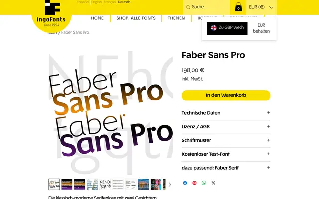
A geometric humanist sans inspired by Futura and Gill Sans, offering a second typographic personality via uncial-derived alternate letterforms for a, f, g, l, r and u.
About
Broad rounded forms on b, c, d, e, o, p, q and their capitals define the rhythm, contrasted by sharp triangular points on v, w, z and the uppercase A, M, N, V, W, Z. The shortened ascender on the f and a full true italic with handwriting-derived forms for a and g distinguish it from more mechanical interpretations of the genre. Activating the alternate set, modelled on late-antique and early-medieval uncial scripts, produces a markedly different, more playful character from the same underlying design.
Classification
Draws explicitly from Futura and Gill Sans, combining geometric proportions with humanist warmth. Broad rounded forms and a true italic rooted in handwriting place it in the geometric-humanist tradition.