DeFonte Plus
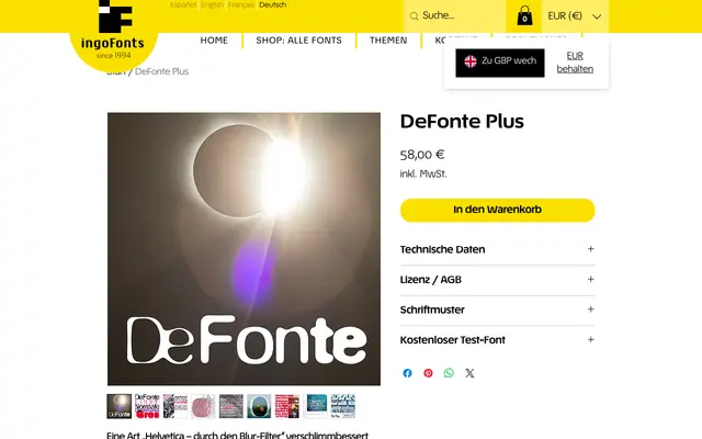
A Helvetica-derived display typeface that simulates photographic overexposure, producing four weights each distorted in a distinct and consistent way.
About
The lightest weight, DeFonte Léger, fractures at its thinnest strokes whilst darkened ink-traps accumulate at junctions, as though consumed by surrounding light. Heavier weights shift the effect to terminals and corners, rounding them severely, while the bold DeFonte Gros collapses counters into blotches that nonetheless retain surprising legibility. The concept is coherent and deliberately applied across all four cuts.
Classification
Based on Helvetica but processed through a simulated photographic overexposure effect, producing distorted, blurred letterforms. The effect places it firmly in the display/distressed category rather than a conventional grotesque.