DeBox Expanded
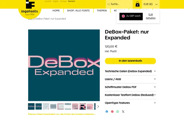
A wide-cut geometric sans with subtly rectangular letterforms, offering selectable x-height variants and a leftward-leaning slanted cut alongside the conventional oblique.
About
DeBox Expanded belongs to the broader DeBox family, which spans Extra Condensed to Extra Expanded widths and Hairline to Black weights in variable font form. Its defining character comes from rounds that lean toward the rectangle, wedge-shaped details in the e, a, f, t, Q and R, and an unconventional bowl-shaped lowercase u without the usual right-side stroke. A selectable x-height axis allows the n-height to shift from delicately small to imposingly tall within the same point size, while alternate forms exist for the distinctive X and u glyphs.
Classification
A geometric sans-serif with deliberately rectangular, 'boxy' proportions – rounds that tend toward the rectangle rather than the circle – placing it firmly in the geometric sans tradition with a distinctive structural character.