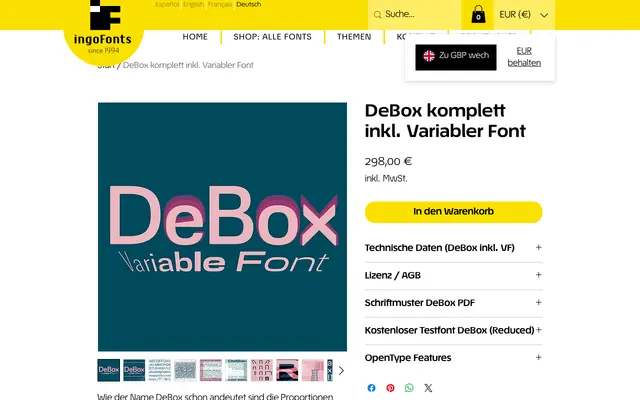
A geometric sans-serif with deliberately rectangularised curves, variable-font axes spanning Hairline to Black and Extra Condensed to Extra Expanded, and an adjustable x-height.
About
DeBox takes the familiar proportions of a workaday grotesque and introduces rectangular rounding to every curve, with wedge-shaped ink traps visible particularly in the lowercase e and a, the crossbars of f and t, and the feet of Q and R. Distinctive glyphs include an X with unusual top and bottom spurs and a bowl-shaped lowercase u without a terminal stroke on the right, both available in conventional alternate forms. The variable font allows continuous adjustment of weight, width and x-height simultaneously, while the static instances cover the central range without the extremes.
Classification
A sans-serif with deliberately boxy, rectangularised forms and wedge-shaped details in key glyphs; the restrained, upright proportions place it within the geometric sans tradition, though its variable axis system and optical quirks give it a distinctly individual character.